Ming Hin Cheung


Week #3 Response/Week #3 Response

Week 3 response Ming Hin Cheung

Posted by Ming Hin Cheung on

Week 3 response

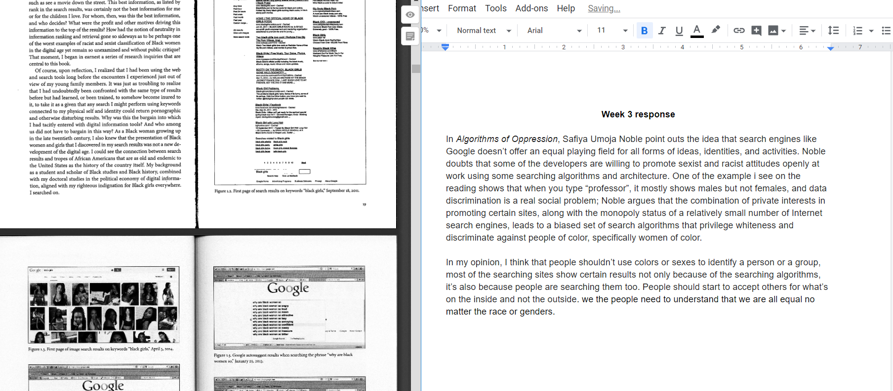
In Algorithms of Oppression, Safiya Umoja Noble point outs the idea that search engines like Google doesn’t offer an equal playing field for all forms of ideas, identities, and activities. Noble  doubts that some of the developers are willing to promote sexist and racist attitudes openly at work using some searching algorithms and architecture. One of the example i see on the reading shows that when you type “professor”, it mostly shows males but not females, it shows that data discrimination is a real social problem; Noble argues that the combination of private interests in promoting certain sites, along with the monopoly status of a relatively small number of Internet search engines, leads to a biased set of search algorithms that privilege whiteness and discriminate against people of color, specifically women of color.In my opinion, I think that people shouldn’t use colors or sexes to identify curtain people or groups, most of the searching sites show certain results not only because of the searching algorithms, it’s also because people are searching them too. People should start to accept others for what’s on the inside and not the outside. we the people need to understand that we are all equal no matter the race or genders.

Week #2 Response/Week #2 Response

week#2 response

Posted by Ming Hin Cheung on

Week 2 response

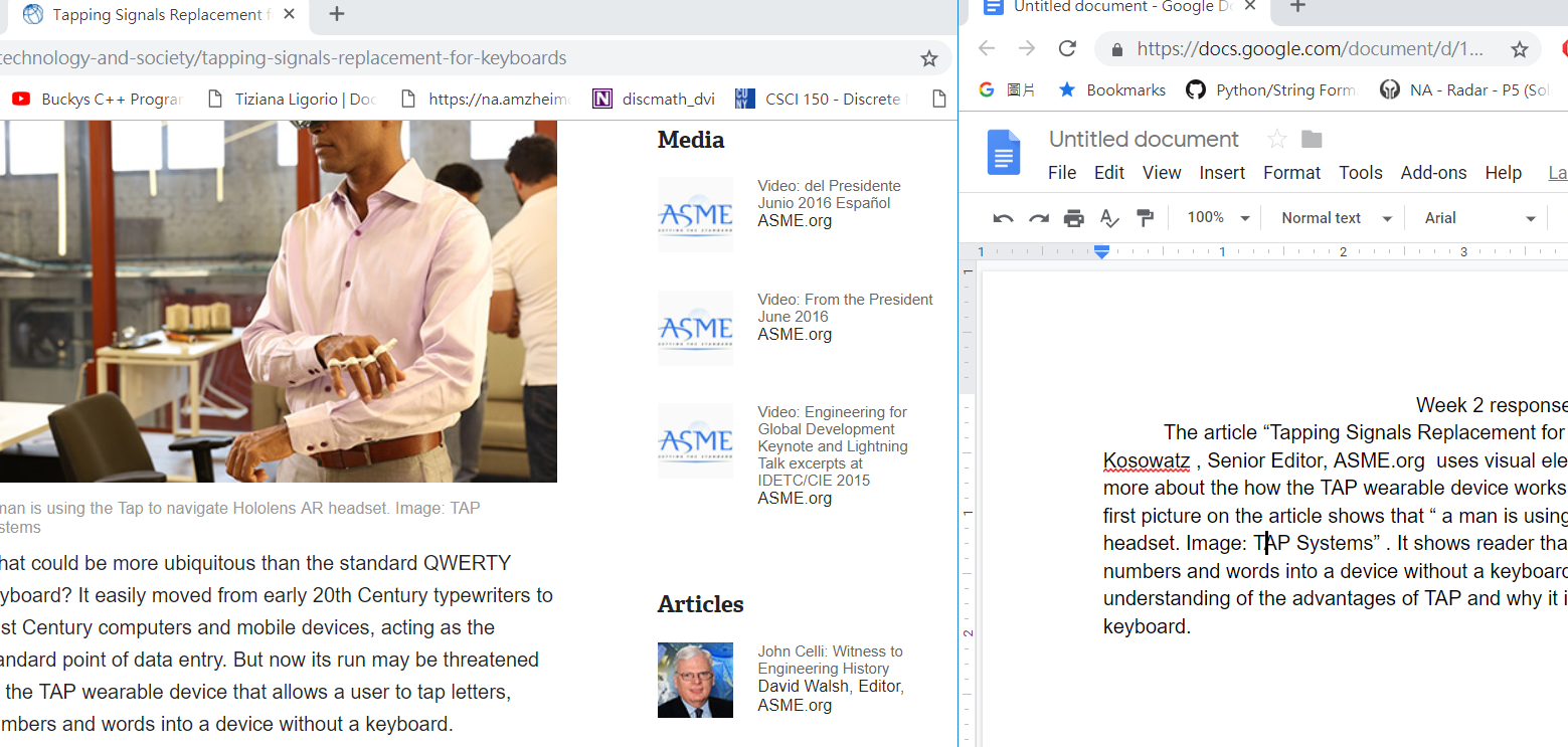
        The article “Tapping Signals Replacement for Keyboards” written by John Kosowatz , Senior Editor, ASME.org  uses visual elements to help reader understand more about the how the TAP wearable device works and the benefits of using it.  The first picture on the article shows that “ a man is using the TAP to navigate Hololens AR headset. Image: TAP Systems” . It demonstrates reader about the function of the TAP. TAP allows a user to tap letters, numbers and words into a device without a keyboard. It gives the reader a better understanding of the advantages of TAP and why it is more convenient than normal keyboard. One of the primary advantage visual elements offers is simplicity. For example, when you get lost by reading a long article, you can find it easier and faster by looking at picture to get the information the author wanted to express. Visual elements are relatively more eye-pleasing. When presenting an amazing shot, it makes people relaxed. A funny picture makes people laugh and will help people memorize the information better.

The second picture in the article shows readers the actual product, it is a “wearable keyboard, mouse and game controller that connects to most Bluetooth enabled devices. Image: TAP Systems”. It helps the reader remember the product.

when people cannot understand foreign language, a picture will remove the language barrier. This is the reason that many article use visual elements in addition to words to send message. Visual charts and graphics can be posted online, put beside the website  on anywhere audible. Such flexible communication form can bridge geographic distance and cross cultural differences.

Visual elements prevails in the efficiency of communication. For example, a bar chart helps the reader find out the first and last item at a glance. A line chart on stock with an uprising arrow tells readers immediately that the stock trend is increasing and favorable.

Skip to toolbar